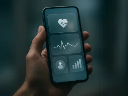

The staggering reality that nearly ninety-five percent of individuals who download a mental health application abandon the platform within the first thirty days highlights a profound disconnect between technological capability and human psychological needs. While the accessibility of digital wellness tools has reached an all-time high, the actual engagement with these platforms is currently suffering from a systemic retention crisis that undermines the very purpose of their existence. Median retention rates frequently plummet to just over three percent after a single month of usage, suggesting that even the most well-funded market leaders are failing to maintain a meaningful connection with those seeking help. This phenomenon is not merely a commercial failure; it represents a critical breakdown in therapeutic delivery. When a user in crisis or a state of chronic distress opens an application only to find it confusing, overwhelming, or emotionally discordant, they are likely to disengage immediately, losing access to vital support structures during their most vulnerable moments.
The design of a user interface in the mental health sector must be viewed through the lens of medical intervention rather than standard consumer interaction. Traditional design metrics, such as “time on page” or “click-through rate,” often run counter to the goals of a person experiencing anxiety or depression. For these individuals, the cognitive load required to navigate a complex or trendy interface can be an insurmountable barrier. Effective design in this space requires a deep understanding of the “distressed user”—someone whose executive function may be temporarily impaired by stress, trauma, or chemical imbalances. By prioritizing simplicity, immediate utility, and emotional safety over visual experimentation, developers can create digital environments that act as a refuge rather than an additional source of frustration. This approach transforms UI from a secondary aesthetic concern into a core component of the treatment process, ensuring that the technology facilitates healing instead of obstructing it.
Navigating the Friction of Modern Trends
The Burden: Visual and Cognitive Complexity
Modern design trends like neo-brutalism, characterized by sharp edges, high-contrast shadows, and intentionally jarring layouts, represent a significant risk when applied to mental health interfaces. While these styles are effective for capturing attention in a crowded marketplace, they demand a high level of cognitive energy to parse and understand. A user experiencing an acute anxiety episode or sensory overload already has a reduced capacity for processing complex visual stimuli. Forcing such an individual to decipher overlapping text or unconventional navigation patterns creates immediate friction, often leading to a “freeze” response that prevents them from reaching the tools they need. The mental energy required to find a simple “start” or “help” button should be near zero, yet trend-driven complexity often turns these basic interactions into puzzles that an overwhelmed mind simply cannot solve.
To mitigate this burden, design systems must prioritize the reduction of visual noise through the implementation of highly predictable, linear flows. Research into cognitive load theory suggests that when working memory is taxed by emotional distress, users perform best with one-task-per-screen architectures. Instead of presenting a sophisticated dashboard filled with various metrics, exercises, and social feeds, successful mental health applications utilize a guided journey that presents a single, clear question or action. This methodology respects the user’s limited executive function and provides a sense of accomplishment through small, manageable steps. By moving away from “delightful surprises”—which can feel unpredictable and threatening to a distressed mind—and toward absolute predictability, designers can lower the entry barrier for those who find standard digital interactions exhausting or intimidating.
Structural Clarity: Moving Beyond Minimalism
Minimalism is frequently touted as the solution to cognitive overload, but in its most extreme “trend-driven” forms, it can actually increase user anxiety through hidden navigation and unlabeled icons. When a user is in a state of low mood or high stress, they often lose the ability to recall what specific abstract symbols represent or where they might have seen a hidden menu drawer. A “clean” interface that relies on user intuition rather than explicit instruction creates a “guess-and-check” environment that is entirely unsuitable for a person in need of immediate relief. If a user has to tap five different icons just to find the emergency contact button or a grounding exercise, the application has fundamentally failed to provide the safety it promised. Clarity must always supersede aesthetics in this context, ensuring that every function is labeled clearly and placed within the primary visual field.
Effective structural design for mental health involves the use of familiar, “low-stakes” patterns that do not require the user to learn a new language of interaction. This means adhering to standard platform conventions, such as bottom navigation bars for mobile devices and clearly defined headers that orient the user within the application’s hierarchy. Some of the most effective tools currently in use utilize a “home-base” concept where the user can always return to a safe, familiar screen with a single tap. This sense of spatial stability in a digital environment provides a psychological anchor for the user, signaling that the application is a controlled and reliable space. By ensuring that navigation is transparent and that the interface never “hides” its value behind experimental gestures, developers can foster the long-term trust that is necessary for sustained therapeutic engagement.
Aligning Interface Aesthetics with Emotional Reality
The Impact: Tonal Mismatch on Trust
A frequent mistake in the design of wellness applications is the assumption that bright, high-energy colors and cheerful imagery will automatically improve a user’s mood. However, for a person experiencing major depressive disorder or sensory sensitivity, neon yellows, vibrant oranges, and aggressive “happy” animations can feel jarring and physically irritating. This creates a state of “energetic dissonance,” where the interface is broadcasting an emotional frequency that is entirely out of sync with the user’s internal reality. When an app feels too upbeat or demanding of positive energy, it can inadvertently make the user feel more alienated, reinforcing the idea that their current state is “wrong” or “inconvenient” for the platform. This mismatch erodes trust, as the user perceives the application as a generic tool that does not truly understand the depth of their struggle.
To solve this, designers are increasingly turning toward muted, earthy color palettes and customizable “mood-aligned” themes that respect the user’s current state. Utilizing soft greens, deep blues, and taupes creates a visual environment that is calming rather than stimulating, allowing the user’s nervous system to settle. Dark mode is no longer just a preference but a functional necessity for many distressed users, particularly those who experience light sensitivity or migraines as a physical manifestation of their mental health struggles. By providing a subtle and grounded aesthetic, the application communicates empathy through its very appearance. This alignment signals to the user that they are in a space where they do not have to “perform” wellness, but can instead engage with the tools at their own pace and in a way that feels comfortable to their current sensory needs.
Integrating Systems: Empathetic Visual Architecture
The visual language of an application extends beyond color to include typography, iconography, and the pacing of animations. In the realm of mental health UI, “empathetic visual architecture” means selecting fonts with high legibility and soft terminals that lack the aggressive sharpness of modern geometric sans-serifs. High-contrast text can be painful for some, while low-contrast text is illegible for those with “brain fog” or visual fatigue, necessitating a balanced approach that meets accessibility standards while remaining gentle on the eyes. Animations, when used, should be slow, rhythmic, and functional—such as a breathing guide—rather than fast or celebratory. The goal is to create a digital atmosphere that mimics a quiet, safe room, providing a sense of sanctuary that encourages the user to stay and explore the resources available to them.
Functional elements must also remain tonally consistent, which is why gamified features like “spin-to-win” discount wheels or flashy badges for logging a panic attack are widely criticized in current design circles. These elements are seen as shallow and dismissive of the user’s genuine pain, often causing more harm than good. A more supportive approach involves using “quiet” confirmations—subtle haptic feedback or a simple text-based acknowledgement—that validate the user’s effort without overwhelming them with unnecessary visual noise. Every interaction, from the speed of a transition to the wording of a button, must be audited for emotional resonance. When the entire visual system is aligned toward a common goal of calm and support, the interface becomes a silent partner in the user’s journey toward recovery, rather than a distracting or irritating presence.
The Importance of Navigational Stability
Combatting the Paradox: The Choice Problem
One of the greatest obstacles to digital mental health engagement is the “paradox of choice,” where providing too many options results in the user making no choice at all. Many platforms boast massive libraries containing hundreds of meditations, articles, and exercises, which can feel like a daunting mountain to a user who is already struggling with decision fatigue. For someone in a state of high anxiety or depression, the act of scrolling through an endless list of content can trigger a sense of inadequacy or paralysis. They may wonder if they are choosing the “right” exercise, leading to a loop of overthinking that prevents them from actually starting any beneficial activity. This abundance of content, while intended to be a value-add, often becomes a primary reason for the user to close the app and give up entirely.
To address this, designers are moving toward curated, “smart” recommendations that limit the user’s options to a select few based on their current input. Instead of saying “Choose from these 100 meditations,” an effective interface might ask, “How are you feeling right now?” and then provide two or three specific paths tailored to that answer. This reduction of complexity transforms the application from a library into a guide. By offering a “just-in-time” approach to content delivery, the interface takes on the cognitive burden of selection, allowing the user to focus entirely on the therapeutic task at hand. This methodology not only increases the likelihood of the user completing an exercise but also builds confidence, as the user feels they are making progress without the stress of navigating a vast and confusing content ecosystem.
Enhancing Predictability: Building Mental Models
Predictability is the cornerstone of psychological safety in a digital environment, especially for users who manage chronic conditions or navigate frequent crises. When an application undergoes a major redesign or changes its navigation structure to stay “fresh,” it effectively forces the user to re-learn the interface from scratch. For a user in a state of high anxiety, this lack of stability can be a point of extreme friction, as they lose the ability to navigate the app “blindly” during moments of intense emotional struggle. If a user has trained themselves to find a specific grounding tool in the top-right corner, moving that tool to a hidden menu in an update can feel like a betrayal of the trust they have placed in the platform. Designing for stability means prioritizing a permanent information architecture that remains consistent over years rather than months.
The use of familiar metaphors can also enhance predictability by aligning the digital experience with real-world objects and spaces. Some applications utilize a “digital room” metaphor where different tools are represented by household objects—a journal on a desk for writing, a candle for meditation, or a window for breathing exercises. These metaphors create a strong mental model that is easy to recall even when a user is experiencing significant cognitive impairment. By maintaining a stable, intuitive layout, designers ensure that the path to help is always exactly where the user expects it to be. This sense of “spatial memory” is vital for accessibility, as it allows the interface to become an extension of the user’s own coping mechanisms, requiring minimal conscious effort to operate during times of high stress or emotional turbulence.
Prioritizing Universal Access and Ethical Engagement
Addressing Exclusion: Sensory and Motor Needs
Accessibility in mental health design is often overlooked, yet cognitive and sensory challenges frequently co-occur with psychological distress. Trends such as thin, light-gray fonts or tiny tap targets are not just aesthetic choices; they are active barriers that exclude users who may be experiencing “brain fog,” tremors, or visual fatigue. Adhering to the latest Web Content Accessibility Guidelines is a fundamental ethical requirement, ensuring that text is legible under all lighting conditions and that buttons are large enough to be activated by someone whose hands may be shaking from high anxiety. Designing for the “worst-case scenario” of a user’s physical state ensures that the application remains functional and inclusive for everyone, regardless of their immediate physiological condition or level of sensory processing ability.
Interaction models must also account for a variety of motor inputs beyond the standard swipe gesture, which can be difficult for some to execute precisely. While gestures are often seen as intuitive, they can be a source of frustration for those with motor control issues or those simply in a state of high emotional agitation. Providing visible, high-contrast button fallbacks for every gesture-based interaction ensures that no user is locked out of the application’s core functionality. Furthermore, the timing of interactions should be flexible; “press-and-hold” requirements or rapid-fire response prompts can be intimidating. By building interfaces that are forgiving and accommodate a wide range of physical and cognitive speeds, developers create a truly universal tool that does not discriminate based on the user’s current level of physical or mental coordination.
Refining Interaction: The Ethics of Engagement
The ethics of retention are currently under intense scrutiny, particularly regarding the use of “coercive” mechanics like daily streaks or aggressive push notifications. While these features are designed to motivate users, they often create a destructive sense of “performance pressure” for those struggling with depression or low self-esteem. If a user misses a day of logging their mood and sees their thirty-day streak reset to zero, the resulting feelings of guilt and failure can exacerbate the very symptoms the app was meant to treat. A mental health tool should never make a user feel like they are failing at their own recovery. The shift toward a more supportive model involves using “forgiving” streaks—where a missed day does not reset progress—or removing the focus on daily performance entirely in favor of long-term wellness trends.
Interactions within the app should be purposeful and finite, encouraging the user to get what they need and then put their phone down to return to their life. Unlike social media platforms that aim to maximize screen time through infinite scrolls and variable rewards, a healthy mental health app should aim to minimize the time a user spends staring at a screen. This means designing for “efficiency of care” rather than “engagement.” Features should be structured to provide immediate value without dragging the user into a cycle of mindless consumption. By focusing on the user’s well-being outside of the digital environment, developers can build a product that is truly ethical and sustainable. This approach prioritizes the long-term mental health of the user over short-term data metrics, ultimately leading to a higher quality of trust and a more meaningful impact on the user’s life.
A Systematic Framework for Evaluation
Implementing Standards: Compassionate Design
To ensure that a design truly serves the user, every development decision should be filtered through a rigorous framework that evaluates its impact on a distressed mind. This process begins with a comprehensive cognitive load assessment, which identifies any UI element that might add unnecessary mental effort for an overwhelmed individual. Designers must look beyond the “happy path” and specifically audit how the interface behaves when a user is frustrated, tired, or in a state of panic. Emotional alignment checks are equally important, ensuring that the visual tone, language, and pacing of the application support the full spectrum of psychological states. This systematic approach moves design away from subjective preference and toward a science-based methodology that prioritizes the user’s immediate cognitive and emotional safety.
Navigational reliability and accessibility verification form the second half of this evaluation framework. Interfaces must be tested for predictability, ensuring that users can find critical tools without having to search through complex menus or learn new interaction paradigms. This involves rigorous usability testing with diverse groups, including individuals who are currently managing mental health conditions. Finally, an engagement integrity review is necessary to ensure that the application’s return mechanics are supportive rather than manipulative. By focusing on building long-term trust rather than high-frequency interaction, developers can create tools that are perceived as reliable partners in the user’s care. This framework provides a roadmap for creating digital environments that respect the dignity of the user and provide a genuine sense of refuge from the chaos of the outside world.
Auditing Impact: Sustainability and Clinical Support
The final stage of evaluating a mental health interface involves an audit of its long-term impact and its integration with existing clinical support systems. It is not enough for an app to be “easy to use”; it must also be effective in delivering its therapeutic content without causing unintended harm. This requires a close collaboration between designers, developers, and mental health professionals to ensure that the UI choices are grounded in proven psychological principles. For instance, the way a “crisis button” is positioned and the steps that follow must be clinically sound, providing immediate and clear directions to professional help. Regular auditing of these flows ensures that they remain functional and relevant, especially as the landscape of digital health and professional emergency services continues to evolve and change.
Designers must also consider the “digital footprint” of their applications and how they interact with the broader ecosystem of the user’s life. This includes ensuring data privacy and transparency, as users in distress are often more vulnerable to concerns about their personal information being misused. Providing clear, simple explanations of how data is handled can alleviate anxiety and further build the foundation of trust required for a successful digital intervention. By integrating these ethical and clinical considerations into the design process, the industry can move toward a more mature and responsible model of digital care. The goal is to build a systematic way of creating tools that do not just look good on a screen but actually function as a lifeline, bridging the gap between those who need help and the resources that can save their lives.
Future Considerations for Digital Support
Developers and designers recognized that the path to effective mental health support was paved with simplicity and predictability rather than visual novelty. By moving away from high-friction trends and toward a philosophy of digital refuge, the industry took significant steps toward solving the retention crisis. The focus shifted from maximizing screen time to maximizing the user’s emotional stability, which allowed these tools to become integrated into the daily routines of millions without causing additional stress. Accessible interaction models and muted, grounding aesthetics became the standard for the industry, ensuring that no user was excluded due to sensory overload or cognitive fatigue. These changes allowed for a more empathetic digital landscape where technology served as a quiet, reliable partner in the healing process.
Actionable progress in the coming years depended on the rigorous implementation of compassionate design frameworks that prioritized the needs of the reduced-capacity user. Organizations began to conduct regular emotional alignment audits and cognitive load assessments as a standard part of their development cycles. The removal of coercive gamification and the introduction of “forgiving” engagement mechanics helped to build a deeper level of trust between platforms and their users. As the industry continued to mature, the focus remained on refining the efficiency of care and ensuring that every digital interaction was a meaningful step toward real-world well-being. By maintaining this commitment to ethical design, the tech community ensured that mental health applications finally fulfilled their potential as vital, life-saving instruments in the global healthcare system.