
The mobile software landscape is undergoing a massive transformation as interfaces move away from the static, flat designs of previous years toward more organic and responsive environments. Xiaomi is at the forefront of this shift, preparing to launch its HyperOS 4 update which introduces a bold new design language known as Liquid Glass. This aesthetic evolution represents a departure from traditional opaque layers and rigid structures, favoring a system that feels alive and physically present within the glass of the smartphone. By emphasizing depth, translucency, and fluid motion, the company aims to bridge the gap between digital content and the physical device hardware. The objective is to create a user experience that feels less like looking at a screen and more like interacting with a tactile, three-dimensional object. This preview into the next generation of software reveals how subtle changes in lighting and material physics can profoundly alter the daily interaction with technology.
Core Principles: The Liquid Glass Philosophy
Visual Depth: Material Surfaces
The core of the Liquid Glass philosophy lies in its realistic treatment of depth and light through advanced rendering techniques. Moving beyond simple blurring effects that have been common in mobile operating systems for years, the new design incorporates highlights and reflections to mimic the physical properties of polished glass surfaces. This creates a wet or glossy appearance where elements like notification cards and system folders appear to float above the home screen with tangible weight. By simulating the way light refracts through a transparent medium, the interface establishes a clear visual hierarchy that feels both premium and responsive to user input. Every interaction is designed to evoke the sensation of touching a physical material, which significantly reduces the cognitive load required to distinguish between different layers of the user interface. This attention to detail ensures that the software does not just look modern but also functions with a sense of structural logic and elegance.
In addition to visual aesthetics, the material physics approach incorporates sophisticated animation curves that respond to the velocity and direction of a user’s touch. When a user swipes a notification away, the translucent panel behaves as though it has momentum, sliding with a friction-based deceleration that mirrors real-world physics. This continuity of motion is essential for maintaining the illusion of the Liquid Glass environment, as it prevents the jarring transitions that often occur in less optimized software skins. The system also utilizes real-time shadows that change based on the virtual light source within the theme, further grounding the interface in a three-dimensional space. These enhancements are not merely cosmetic; they provide essential feedback to the user, making the operating system feel more intuitive and natural. By aligning digital behavior with physical expectations, Xiaomi is creating a more harmonious relationship between the user and the digital tool, moving toward a future where software feels like a physical object.
Unified Design: Wallpaper Integration
This aesthetic shift also focuses on how system elements interact with the user’s chosen wallpaper and environmental themes. By using semi-transparent backgrounds throughout the system, the interface allows the colors and tones of the primary background image to bleed through widgets and system folders. This ensures that the phone’s personality remains visible across all screens, creating a unified look that avoids the cluttered feel of traditional solid-colored blocks. The software dynamically adjusts the opacity and saturation of these layers based on the complexity of the underlying image, ensuring that text remains legible without sacrificing the translucent effect. This integration makes the software feel like a singular, cohesive canvas rather than a series of disconnected menus and windows. Users can experience a sense of continuity as they navigate through various applications, as the background elements provide a constant visual anchor that ties the entire operating system together into a sleek package.
Moreover, the depth-based design extends to the way folders and multitasking windows are presented to the user. When a folder is opened, the surrounding background does not simply blur; it recedes into the distance, creating a focal point on the active content while maintaining a sense of spatial awareness. This technique, often referred to as spatial layering, helps users keep track of their location within the system architecture, reducing the likelihood of becoming lost in deep menu trees. The implementation of Liquid Glass also includes a revised set of system icons that feature multi-layered textures, allowing them to shift slightly as the device is tilted. This parallax effect adds another dimension to the home screen, making the icons appear to be encased within a thin layer of glass. By prioritizing these subtle visual cues, the developers have crafted an environment that feels expansive and deep, successfully utilizing the high-resolution displays of modern hardware to their fullest potential during daily smartphone use.
Functional Improvements: Technical Constraints
Control Center: Reconfiguring the Layout
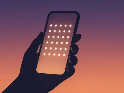
A significant portion of the HyperOS 4 update involves a total reconfiguration of the Control Center to balance utility with visual clarity. The new layout uses a mix of circular toggles and translucent rectangular tiles, providing a dense but organized collection of shortcuts that are easy to navigate with one hand. These tiles utilize the Liquid Glass effect to distinguish between active and inactive states, with active icons glowing softly as if illuminated from behind the glass surface. This design choice makes it immediately obvious which features are enabled, such as Wi-Fi or Bluetooth, without requiring the user to read small text labels. The spacing between elements has been optimized to prevent accidental touches, while the overall transparency ensures that the user’s wallpaper remains a visible part of the experience. This reconfiguration is a direct response to user feedback requesting a more streamlined and visually appealing way to manage system settings quickly, resulting in a more efficient and aesthetically pleasing control hub.
The functional improvements within the Control Center also include expanded support for smart home integration and media playback. Users can now access their connected devices through a dedicated panel that adopts the same translucent design language, allowing for seamless transitions between phone settings and home automation. Media controls have been repositioned for better ergonomics, featuring larger buttons and a progress bar that responds with fluid animations when adjusted. These changes reflect a broader commitment to making the operating system more versatile and capable of handling the increasing complexity of a connected lifestyle. By centralizing these controls in a visually consistent environment, the software reduces the friction associated with managing multiple devices and services. The use of Liquid Glass in this context serves a functional purpose by providing a clear, non-intrusive overlay that sits on top of the current task, allowing users to make quick adjustments without losing their place in an application or video.
Performance Optimization: System Efficiency
Looking at the performance side, the implementation of such complex visual effects required significant optimizations to the system kernel and graphics drivers. To ensure that the Liquid Glass design does not compromise battery life or system responsiveness, the developers introduced a new rendering engine that offloads much of the transparency processing to dedicated hardware accelerators. This approach allows for smooth animations at high refresh rates without placing an excessive burden on the central processing unit. System resource management has also been refined to prioritize the active layer, ensuring that background processes do not interfere with the fluidity of the user interface. These technical advancements are crucial for maintaining the premium feel of the software, as any stutter or lag would quickly break the illusion of the physical material design. The balance between visual fidelity and operational efficiency is a hallmark of this update, demonstrating a mature approach to software development that values both form and function equally.
In conclusion, the transition to this new design language represented a fundamental shift in how digital environments were constructed and experienced. Developers focused on refining the interplay between hardware capabilities and software aesthetics, resulting in an interface that felt both familiar and revolutionary. Organizations and individual users were encouraged to explore these new customization options to better align their devices with their personal workflows. The emphasis on spatial depth and translucent materials provided a blueprint for how future operating systems could continue to evolve toward even more immersive interactions. By prioritizing performance optimizations alongside visual flair, the system successfully avoided the common pitfalls of resource-heavy skins. Those looking to maximize their experience should begin by auditing their home screen layouts to take full advantage of the improved visual hierarchy. This era of design solidified the importance of material-inspired interfaces in creating a truly modern mobile experience.