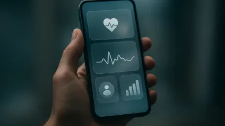

The absence of Dynamic Color on the iOS version of Google apps stems from Apple’s strict restrictions regarding third-party access to wallpaper data. Despite this technical limitation, the visual landscape of mobile software is undergoing a significant transformation as major developers move away from rigid, platform-exclusive identities toward a more integrated aesthetic. For years, users of the iPhone version of Google services frequently complained about a disjointed experience where apps felt like unpolished ports of their Android counterparts. However, the latest updates to Google Photos and Google Health signal a decisive break from this legacy, embracing the sophisticated translucency often referred to as Liquid Glass. This design shift is not merely cosmetic; it represents a strategic acknowledgment that a high-quality user experience must respect the visual vocabulary of the host operating system. By blending the core principles of Material 3 Expressive with the frosted textures native to iOS 27, Google is successfully narrowing the gap between third-party utility and native-level fluidity. This change fosters a much more harmonious environment for long-term users.
Evolutionary Shifts: Cross-Platform Design
Integrating Liquid Glass Aesthetics
The transition toward a glass-like interface is most evident in the recent deployment of Google Photos version 7.94, which introduces a fundamental change to the way content is framed within the application. Gone is the solid, opaque background that traditionally anchored the bottom navigation bar, replaced instead by a layered, translucent surface that allows the vibrant colors of the photo grid to bleed through. This implementation offers users a new level of customization through a More clear setting, providing even higher visibility for background content and reducing the visual weight of the interface controls. This layered approach creates a sense of depth, making the navigation elements appear as though they are floating above the content rather than being bolted onto it. Furthermore, the dark mode has been meticulously refined with a soft blue tint for active tabs, ensuring that the interface remains readable while maintaining the sleek, premium feel that modern iPhone users expect from high-end software. Every element works together to create a cohesive and professional display.
Refining the User Interaction Model
Beyond the primary navigation components, the Liquid Glass aesthetic has been applied to the more interactive elements of the user interface, specifically within the Google Health ecosystem. The floating action buttons and the newly introduced Ask Coach feature now utilize this frosted treatment, creating a cohesive visual language that spans across multiple utility apps. This design choice ensures that the interface feels integrated into the broader iOS environment rather than isolated within its own silo. By adopting these translucent layers, Google effectively minimizes the jarring transitions that previously occurred when moving from native system menus to third-party applications. The use of adaptive blurring and subtle shadows further enhances this effect, providing tactile feedback that mimics physical materials. This attention to detail demonstrates a commitment to platform-specific refinement, suggesting that Google is no longer content with a one-size-fits-all approach to its global software suite, instead choosing to optimize for specific hardware ecosystems. It marks a new era for visual consistency.
Strategic Convergence: Remaining Disparities
Alignment: Modern OS Standards
This strategic shift highlights a broader trend of convergence between the two dominant mobile ecosystems, where the boundaries between Android 17 and iOS 27 continue to blur in favor of a unified user experience. As both platforms mature, they are increasingly sharing core design philosophies, privacy defaults, and advanced artificial intelligence integrations while striving to maintain distinct brand identities. Google’s decision to adopt Apple’s preferred design cues suggests an understanding that software loyalty is often tied to how naturally an app fits into a user’s daily digital environment. However, this evolution is not yet universal across the Google Workspace. While flagship apps like Photos and Health lead the charge, secondary productivity tools such as Google Docs, Sheets, and Slides remain tethered to the older Material Theme architecture. This inconsistency creates a fractured experience for power users who rely on the full suite of services, highlighting the logistical challenges of updating a massive software portfolio on a per-app basis. Achieving total parity remains a complex long-term goal.
Future Implementation: Ecosystem Cohesion
The gradual rollout of these design updates established a clear path toward a future where cross-platform friction becomes a relic of the past. As developers recognized that visual harmony was just as important as functional parity, the move toward Liquid Glass aesthetics provided a scalable solution for integrating complex services into the Apple ecosystem. While the absence of deep system integrations like Dynamic Color remained a hurdle due to privacy constraints, the focus shifted toward actionable improvements in translucency and depth that users could appreciate immediately. This transition suggested that the next phase of mobile software would prioritize environmental awareness, where apps automatically adjusted their visual density and color palettes to match the host system’s evolving standards. Ultimately, the updates to Photos and Health functioned as a blueprint for other developers to follow, proving that it was possible to maintain a strong brand identity while fully embracing the unique design language of competing hardware, thus ensuring a more seamless and intuitive experience for everyone.