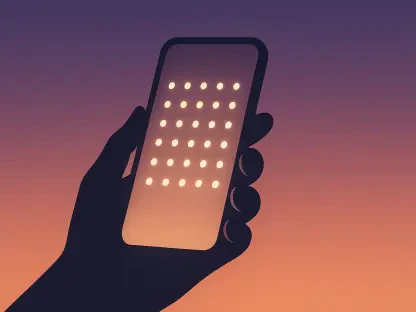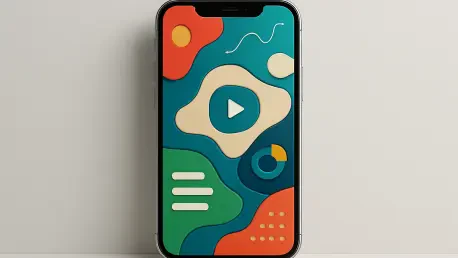

Traditional definitions of user-centric design are being challenged by a generation that values individuality more than the efficiency of a streamlined interface. For years, the prevailing wisdom in Silicon Valley dictated that the ideal user experience was invisible, frictionless, and dominated by negative space. However, younger users are now intentionally dismantling these sterile environments in favor of digital maximalism, a trend characterized by cluttered home screens, mismatched icons, and layers of overlapping widgets. This shift marks a significant departure from the minimalist aesthetic that defined the previous decade. Instead of seeking a phone that looks like a factory-reset device, Gen Z users are treating their mobile interfaces as deeply personal scrapbooks. This movement is not a result of technical ignorance but is a deliberate aesthetic choice that prioritizes emotional resonance over the standardized speed of navigation. By 2026, the clean look has started to feel impersonal and corporate, prompting a widespread embrace of visual chaos that reflects the messy reality of modern digital identities.
Redefining the Interface Aesthetic
The Rejection: Why Minimalism Failed to Hold
The movement toward chaotic layouts represents a rebellion against the algorithmic uniformity that has dominated social media and mobile operating systems for years. Users have grown weary of the blanding of digital spaces, where every application follows the same grid and every notification follows the same predictable logic. By purposefully cluttering their screens with stacks of widgets—ranging from rotating photo galleries to live weather sensors and niche habit trackers—individuals are reclaiming agency over their primary digital tool. This behavior suggests that the modern consumer no longer views the smartphone merely as a utility for communication, but as a primary canvas for self-expression. In this context, a crowded and messy screen is viewed as a sign of a life well-lived and a personality fully articulated. Designers who once optimized for the fewest clicks possible are now observing users who intentionally add complexity to their daily routines. This aesthetic shift signals a fundamental change in how the relationship between human and machine is visualized.
Personal Curation: The Rise of Digital Scrapbooking
Sophisticated customization tools have transformed the iOS home screen into a highly specific environment that requires significant time and curation to maintain. Utilizing third-party applications and advanced automation features, users are replacing standard system icons with custom graphics that often lack the immediate recognizability of original brand logos. This prioritization of vibe over legibility is a hallmark of the new design philosophy. The resulting interfaces are often incomprehensible to outsiders, functioning as a sort of visual shorthand that only the owner can navigate efficiently. Such high levels of customization create a stronger psychological bond between the user and the device, as the interface becomes a unique digital ecosystem. Furthermore, the inclusion of non-functional aesthetic elements, such as decorative quote widgets or purely visual dividers, highlights a desire for comfort rather than raw productivity. This evolution has forced software developers to rethink the rigid boundaries of their interface guidelines to accommodate a user base that demands total creative control.
Implications for Modern Product Development
Adapting Systems: Software Response to Maximalism
Technological advancements have directly enabled this transition toward complex layouts by providing the processing power and software flexibility needed to handle multiple live-updating elements simultaneously. Current operating system updates have moved away from enforcing strict grid layouts, offering instead more fluid containers that allow for the overlapping and nesting of information. Developers are finding that rigid design systems are increasingly ignored by a demographic that prefers to hack their way to a desired look. In response, platform providers are integrating more robust theming engines directly into the core software, attempting to balance the need for system stability with the user’s demand for visual anarchy. This trend is not limited to home screens; it has bled into the design of the apps themselves, where micro-chaos—small, unexpected design flourishes—is becoming a way to build brand loyalty. The challenge for developers lies in maintaining accessibility standards while allowing for this high degree of visual noise. Success now depends on creating modular designs that can survive being stripped down.
Future Strategies: Lessons from the Personalized Era
The shift toward chaotic and personalized interfaces demonstrated that users were no longer satisfied with corporate uniformity. Product teams that succeeded during this transition abandoned rigid design systems in favor of modular frameworks that allowed for radical customization. These organizations recognized that the value of a digital tool was increasingly tied to how well it functioned as a canvas for the user’s identity. It became clear that providing high-quality, customizable assets was more effective than imposing a single brand aesthetic. Leading developers integrated interoperability into their core pipelines, ensuring that third-party modifications did not compromise system security or performance. Ultimately, the industry learned that flexibility was the most critical feature of any modern interface. Companies were encouraged to prioritize user-led curation and provide the technical infrastructure necessary for creative expression. This approach ensured that digital environments remained relevant in a market defined by a constant demand for individuality and visual distinction.