
Vijay Raina is a seasoned expert in enterprise SaaS technology and software architecture, known for his deep understanding of how modern web standards translate into premium user experiences. With a background that spans the evolution from fragile background-image hacks to the sophisticated CSS properties of today, Vijay provides a unique perspective on the intersection of technical implementation and visual storytelling. In this conversation, we explore the transformative potential of the corner-shape property, a tool that is finally liberating developers from the rigid constraints of circular rounding.
The discussion covers the technical mechanics of how corner-shape modifies the border-radius curve, the elimination of layout “fragility” previously caused by SVG masks and clip-paths, and the strategic use of shapes like squircle, scoop, and bevel to establish visual hierarchy. We also dive into the nuances of the superellipse() function for fluid animations and the importance of a “good and better” design tiering strategy for progressive enhancement.
How do border-radius and corner-shape work together as a technical pair, and what specific visual outcomes occur when you apply a scoop or notch value to an element? Please walk through the dependency between these two properties and how they modify the curve.
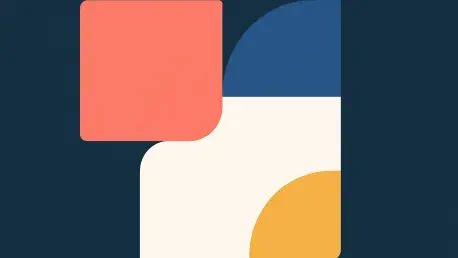
It is important to understand that corner-shape is not a replacement for border-radius; it is a companion that modifies the existing curve. Without a defined border-radius, the corner-shape property effectively does nothing because there is no radius to reshape. When you apply a value like scoop, the browser takes those radius endpoints and creates an inverted, concave curve, which is perfect for an organic, hand-crafted feel in editorial designs. On the other hand, the notch value creates sharp inward cuts, giving an element a machine-stamped or industrial appearance. By adjusting the border-radius to a value like 12px or 14px and then applying these shapes, you are essentially telling the browser to use that 12px area for a specific geometric transition rather than a standard circular arc.
Developers previously relied on clip-path or SVG masks for non-round corners, often losing box-shadow and border consistency. How does corner-shape resolve these specific styling conflicts, and what layout “fragility” does this eliminate when a component’s padding or size changes?
The primary issue with clip-path and SVG masks is that they are “dumb” masks that physically cut the element, which means borders don’t follow the path and box shadows are often clipped out of existence. This creates what I call “fiddly code” that breaks the moment a developer changes a padding value or the content causes the box to grow. The corner-shape property resolves this because the shape is the box boundary, meaning outlines, shadows, and backgrounds naturally follow the new geometry. By treating the shape as a native property of the box model, we eliminate the fragility of maintaining separate polygon coordinates that have to be manually recalculated whenever the layout shifts.
Creating directional UI elements like ribbon badges often requires complex polygon coordinates or pseudo-elements. How can mixing values like round and bevel per corner simplify this process, and what are the practical steps for ensuring these shapes stay aligned with the card edge?
We can now create directional ribbons by simply declaring different values for each corner, such as corner-shape: round bevel bevel round. In this scenario, the left side stays rounded where it meets the card edge, while the right side is beveled to a sharp point, creating an instant “arrow” effect without a single line of SVG or a complex pseudo-element. To keep these aligned, you simply set a small border-radius like 4px or 16px and let the property handle the rest. This approach is far more robust because the badge remains a standard block element that respects the document flow, making it significantly easier to maintain than a rotated pseudo-element or a hard-coded clip-path: polygon().
Different shapes evoke distinct aesthetic “feels,” such as the organic quality of a scoop or the premium “iOS effect” of a squircle. In a high-stakes UI like a pricing table, how would you strategically assign these shapes to establish visual hierarchy and emphasize featured plans?
In a pricing table, shape becomes a powerful tool for psychological emphasis rather than just a decorative choice. I would assign the squircle (the smooth Apple-style superellipse) to the standard plans to give them a modern, premium feel that already looks “better” than standard rounding. For the featured plan, I’d switch to a scoop corner-shape with a generous 24px radius to create a distinct, concave silhouette that immediately draws the eye away from its neighbors. To complete the hierarchy, a “Most Popular” badge can be set to bevel, creating a faceted, gem-like appearance that feels like a jewel pinned to the card, effectively using geometry to mirror the content’s importance.
Since superellipse() allows for fine-grained control, how can this function be used to animate transitions between a beveled state and a smooth rounded state? Please describe the logic behind using numeric parameters to achieve a fluid, “gem-like” interaction on hover.
The superellipse() function is the engine behind these presets, and using it with numeric parameters allows for incredibly smooth interpolation during transitions. For example, superellipse(0) is mathematically equivalent to a bevel, and as you increase that value, the corners begin to “inflate” and soften. You can create a primary button that starts as a sharp, faceted gem with corner-shape: bevel and then transitions to a soft squircle on hover over a 0.3s duration. Because the browser is simply calculating the shift in the superellipse curvature, the interaction feels fluid and organic rather than a jarring jump between two different shapes.
Given that browser support is currently evolving, how should a “good and better” design tier be structured using @supports and CSS layers? What specific fallback strategies ensure the UI remains polished and professional even when these advanced shapes aren’t rendered?
We must stop designing “around” the lack of support and instead build a solid foundation where the baseline is a complete, professional design. I recommend using @layer to separate your base presentation from your enhancements, ensuring the “good” version uses standard border-radius values that work in all browsers. Inside a @layer demo block, you wrap your advanced shapes in an @supports (corner-shape: bevel) rule, which allows Chrome 139+ users to see the “better” version while everyone else gets a polished, standard UI. This ensures there are no “broken” layouts or embarrassing support messages, just a tiered experience where the design scales in sophistication based on the browser’s capabilities.
What is your forecast for the future of CSS shape properties?
I believe we are entering an era where the “rounded rectangle” will no longer be the default language of the web, and we will see a significant shift toward more expressive, organic layouts. As corner-shape gains broader support in Safari and Firefox, the technical debt of using SVG hacks and clip-path will vanish, allowing designers to treat UI elements more like physical objects with distinct textures and edges. Eventually, properties like the upcoming “border-shape” will further expand this, but for now, the ability to mix scoop, bevel, and squircle is the most significant step forward in box-model styling since 2010. My advice for readers is to start experimenting with these properties today using progressive enhancement—don’t wait for 100% browser support to begin adding that “extra bit of joy” to your user interfaces.