
While the principle of randomization stands as the undisputed cornerstone of modern A/B testing, a subtle yet potent threat can systematically dismantle the integrity of an experiment long after users have been neatly sorted into control and treatment groups. This insidious problem, known as exposure bias, arises not from a flawed randomization algorithm but from post-assignment discrepancies in data collection, user eligibility, or system performance that create an “effective-sample mismatch.” The result is a distorted comparison between two fundamentally different user populations, rendering any observed outcome unreliable. A powerful, intuitive diagnostic technique—visualizing key metrics over time—offers a critical line of defense, empowering analysts to unmask these hidden imbalances before they lead to misguided and potentially costly business decisions. This approach moves beyond blind faith in randomization, advocating for a more vigilant and evidence-based validation of experimental integrity from the very start.
The Illusion of a Perfect Experiment
The primary vulnerability in A/B testing lies in the often-overlooked gap between the assigned population and the observed population that is ultimately analyzed. Although randomization ensures that user characteristics are balanced at the point of assignment, subsequent processes can corrupt this balance. For example, if a new feature in the treatment group introduces latency, users on slower devices or networks might be less likely to complete an action and be logged, systematically removing them from the final dataset. Similarly, if instrumentation is more robust for one variant than another, it might capture more data from a specific user segment, skewing the sample. This phenomenon means that even with a perfect 50/50 split of users, the final analysis might be comparing a treatment group rich in highly engaged users against a control group representing a broader, more typical user base, thereby invalidating the “all else being equal” assumption that underpins causal inference.
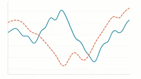
To pierce this illusion of experimental perfection, analysts can employ pre-trigger analysis as a powerful diagnostic tool. The logic is compellingly simple: if the treatment and control groups are truly comparable, their aggregate behavior on a key outcome metric, such as Click-Through Rate (CTR), should be statistically indistinguishable before the treatment is introduced. By plotting the difference in this metric between the two groups over a timeline centered on the trigger event (time zero), any significant, persistent gap in the pre-trigger period serves as a definitive red flag. This pre-existing delta is not a random fluctuation; it is the visual signature of a compositional imbalance, signaling that any post-trigger effects are likely contaminated by this underlying sample mismatch. This check provides crucial assurance that an observed lift is not merely an artifact of comparing two inherently different groups from the outset.
Unmasking Deception Through Simulation
To fully grasp how exposure bias operates and how visualization can detect it, a controlled simulation of a website experiment provides a clear and instructive environment. This simulation begins with a heterogeneous population of users who are pre-categorized into distinct behavioral segments—for example, low-engagement (5% CTR), medium-engagement (10% CTR), and high-engagement (15% CTR). Crucially, this segmentation is independent of the subsequent random assignment to treatment or control groups. In an ideal, unbiased scenario, both the treatment and control arms of the experiment will contain a balanced representation of users from all three segments. This meticulously constructed baseline allows for the precise introduction of bias by systematically altering the observed mix of these segments in one group, thereby isolating and demonstrating the impact of exposure bias on the final results and its corresponding visual fingerprint.
The stark contrast between a healthy experiment and a biased one becomes immediately apparent through visualization. In a properly randomized and instrumented test with no compositional bias, a time-series plot of the CTR difference between the treatment and control groups hovers consistently around zero during the pre-trigger period. This flat baseline confirms the integrity of the setup. When the treatment is introduced at time zero, the line shifts cleanly and maintains its new level, accurately reflecting the true causal impact—whether it’s a positive lift, a negative drop, or no effect at all. This predictable and stable behavior provides analysts with high confidence that the post-trigger shift is directly attributable to the intervention. This visual confirmation of a balanced starting point is an essential prerequisite before any causal claims can be made about the treatment’s effectiveness.
When Bias Creates Phantom Success and Hides Failure
The true danger of ignoring exposure bias emerges when it creates deceptive outcomes that lead to poor decision-making. Consider a scenario where the observed treatment group is skewed to include a disproportionate share of high-engagement users. The time-series visualization for this case would reveal a positive CTR difference before the trigger event even occurs. This pre-existing “lift” is purely an artifact of the sampling mismatch. If the treatment itself has no real effect, this positive gap simply persists after time zero, misleading an analyst into celebrating a phantom success. Even more perilously, this artificial boost can completely mask the harm of a detrimental feature. A true negative impact might be offset by the positive compositional bias, resulting in a final metric that appears neutral or even slightly positive, potentially leading to the rollout of a product change that actively harms the user experience and business goals.
Conversely, exposure bias can create the opposite illusion, suppressing genuine improvements and exaggerating failures. When the analyzed treatment group is skewed toward less-active users, the visualization will show a persistent negative CTR difference from the very beginning. This pre-existing negative gap can make a harmless feature appear detrimental or, more subtly, diminish the perceived impact of a genuinely beneficial one. A feature that provides a true 1% lift might appear to have only a marginal effect because its positive impact is partially canceled out by the negative baseline bias. In the worst-case scenario, this negative bias can compound a real negative treatment effect, dramatically inflating the perceived harm and causing teams to abandon a potentially salvageable idea or overreact to a minor issue. This analysis ultimately demonstrated that relying on randomization alone was insufficient; visualizing the data over time provided the necessary check to prevent misinterpretations, whether they were false positives, masked failures, or suppressed successes.