
Dive into the world of design systems with Vijay Raina, our esteemed expert in enterprise SaaS technology and software design. With a deep background in crafting scalable solutions and providing thought leadership in software architecture, Vijay brings a wealth of knowledge to the table. In this engaging conversation, we explore the intricacies of leveraging component variants and design tokens using Penpot, an open-source design tool. From understanding the foundational role of variants in maintaining design consistency to the practical steps of creating and managing them, Vijay offers invaluable insights into building flexible and sustainable design systems for modern digital projects.
How do component variants contribute to the effectiveness of a design system, and why are they so crucial?
Component variants are essentially different versions of the same base component, allowing designers to adapt a single element for various contexts or states—like a button changing from default to hover or disabled. They’re crucial because they prevent the need to create entirely new components for every slight variation, which can quickly become unmanageable. By grouping these variants together under one main component, you ensure visual and functional consistency across a project. It’s like having a single blueprint that you can tweak without starting from scratch each time, saving effort and maintaining a unified look.
What challenges can surface when component variants aren’t utilized in a design project?
Without component variants, you end up with a fragmented design system where every small change or state requires a standalone component. This leads to a bloated library that’s hard to maintain, with inconsistencies creeping in because there’s no central control. For instance, if you have ten different button styles without variants, updating a color or font means manually adjusting each one. It’s a recipe for errors and wasted time, especially in larger projects where scalability is key.
Can you break down the concept of design tokens and their role in managing component variants?
Design tokens are the smallest building blocks of a design system—think of them as standardized values like colors, font sizes, or spacing that you can reuse across your designs. For component variants, they’re vital because they define what makes one variant different from another. For example, a button’s default state might use a token called ‘color.brand.default’ for its background, while the hover state uses ‘color.brand.lighter.’ By linking variants to these tokens, you can update a single token value and see the change reflected across all related components instantly.
How do aliases for design tokens enhance the flexibility of a design system?
Aliases are like nicknames for design tokens that add a layer of semantic meaning and adaptability. Instead of directly applying a color token like ‘color.brand.default’ to a button, you might create an alias like ‘background.button.primary.default’ that references it. This separation allows you to swap out the underlying color without touching the button’s design or affecting other components using the original token. It’s a powerful way to make targeted changes or adapt to new branding needs without overhauling the entire system.
Could you walk us through the basic process of setting up a color token in Penpot?
Setting up a color token in Penpot is straightforward. First, navigate to the ‘Tokens’ tab in the left panel. Click the plus icon next to ‘Color’ to add a new token. You’ll name it something descriptive, like ‘color.brand.default,’ and input the value—say, hsl(270 100 42)—using the built-in color picker if needed. You can also add a description for clarity. Once saved, this token is ready to be applied to any element or referenced by an alias, forming the foundation for consistent styling across your design.
What’s the distinction between a main component and its instances in Penpot, and why does it matter?
In Penpot, a main component is the original template or master version of a design element, like a button. Instances are copies of that main component that you place throughout your design. The key is that any update to the main component automatically propagates to all instances, ensuring uniformity. This matters because it centralizes control—if you tweak the main button’s border radius, every instance reflects that change instantly, eliminating the risk of inconsistencies and saving a ton of manual effort.
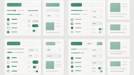
How do you go about creating a new component variant in Penpot, and what are the key steps?
To create a variant in Penpot, start by selecting your main component on the canvas or in the ‘Layers’ tab. Then, either use the Ctrl or Command + K shortcut or click the ‘Create variant’ icon in the ‘Design’ tab on the right panel. Once the variant appears, adjust its properties—swap out design tokens or tweak styles as needed via the same tab. Finally, name the variant property and its value, like labeling a button state as ‘Hover,’ to keep everything organized. Repeat this for each variant, and you’ve got a cohesive set ready to use.
Why is planning ahead so important when working with design tokens and component variants in a design system?
Planning ahead is critical because a design system is a living framework that needs to scale and adapt over time. Without a clear structure for tokens and variants, you risk creating a chaotic mess that’s hard to manage later. Thinking through things like token naming conventions, organizing tokens into sets or themes, and anticipating future component needs—like new states or themes—ensures you can make updates efficiently. It’s about building a foundation that won’t crumble when your project grows or when unexpected changes come up.
Can you share an example of how component variants simplify handling complex designs with multiple states or themes?
Absolutely. Take a button in a complex app that needs to handle states like default, hover, disabled, and active, plus light and dark themes. Using component variants in Penpot, you can create one main button component and define variants for each state and theme combination. Each variant might use different design tokens for colors or text styles, but they’re all linked to the same core component. So, if the button’s shape needs a tweak, you update the main component once, and all variants—across states and themes—adjust accordingly. It turns a potentially overwhelming task into a streamlined process.
What’s your forecast for the future of design systems and tools like Penpot in shaping digital design?
I believe design systems and tools like Penpot will become even more integral to digital design as projects grow in complexity and scale. We’re moving toward a future where design and code are increasingly intertwined, and platforms that express design as code—like Penpot—will bridge the gap between designers and developers more seamlessly. I expect to see deeper integration of AI to suggest or automate token and variant setups, plus enhanced interoperability between tools, making design systems not just a best practice but a necessity for efficient, consistent, and innovative design workflows.