In the world of digital product design, we often talk about creating seamless experiences, but for 466 million people with hearing loss, the digital world is frequently filled with frustrating gaps and silent barriers. To bridge this divide, we sat down with our SaaS and Software expert, Vijay Raina, a specialist who champions inclusive design by focusing on the deaf and hard-of-hearing community. In our conversation, Vijay unpacks the profound impact of the hearing loss spectrum on design choices and challenges the common, often misguided, assumptions developers and designers hold. We explore the nuanced complexities of creating accessible video content, the critical importance of respectful communication and cultural awareness in user research, and how to move beyond basic notifications to create a richer, multi-sensory user experience. He also shares powerful insights into the co-design process, illustrating how direct collaboration with the deaf community doesn’t just improve accessibility—it leads to fundamentally better products for everyone.
The article notes that at a 40dB hearing loss, a person can miss 50% of discussions. How does this specific metric challenge common assumptions in product design, and what’s a step-by-step process you’d use to audit a digital experience for this vast spectrum of hearing?
That 50% figure is incredibly powerful because it shatters the binary way most people think about hearing—that you either hear perfectly or you don’t. The reality is that deafness is a vast spectrum, and a “mild” loss can have a massive impact on comprehension. This metric forces designers to confront the fact that a user might catch every other word, creating a broken and frustrating experience. It’s not about just turning up the volume; it’s about a fundamental breakdown in communication.
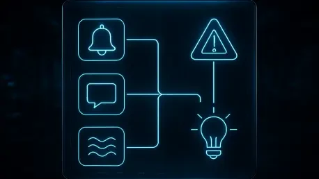
My audit process always begins with challenging this binary assumption. First, I identify every single instance where sound is used to convey information—this includes notification pings, error chimes, video-embedded audio, and even subtle success sounds. Second, for each of these audio cues, I evaluate the existing non-auditory alternatives. Is there a clear visual indicator? Is there a text-based alert? Third, I look for opportunities to add a haptic layer, especially on mobile, to create a more robust, multi-sensory notification system. Finally, and most critically, I bring in users from across the hearing loss spectrum to test the experience. You can’t just assume a text label is sufficient; you have to observe how someone who misses 50% of verbal context actually navigates your product.
Considering sign language is a 4D language and lip-reading is only 30% effective, what are the most common mistakes designers make with video content? Can you share an anecdote about how including descriptions for non-spoken sounds, like [laughter], improved a project’s user experience?
The biggest mistake is assuming that closed captions are a complete solution. Designers often stop at transcribing the spoken words, but so much of communication is non-verbal. They forget that sign languages use 3D space, time, and facial expressions to convey grammar and tone, and that lip-reading is incredibly unreliable—missing 70% of spoken words is a huge gap. Relying solely on a direct transcript of speech is like giving someone a script with all the stage directions and character emotions removed. The context is completely lost.
I remember working on a series of online training videos where the instructor had a very warm, humorous style. The initial captions were just a direct transcription, and the feedback from hard-of-hearing users was that the content felt dry and the instructor seemed disengaged. We went back and added descriptions for non-spoken sounds. When a joke landed, we added [audience laughter]. When the instructor chuckled at his own mistake, we added [chuckles]. The difference was night and day. Users told us the entire tone of the videos changed; they felt more connected to the instructor and the material, and their comprehension and retention improved because the emotional context was no longer missing.
The text highlights the important distinction between ‘Deaf’ and ‘deaf’. When conducting user research, how do you respectfully navigate these communication preferences and literacy levels? Please walk us through your protocol for setting up and running a successful usability test with the deaf community.
Navigating this is absolutely crucial, and it begins with understanding that you’re engaging with a cultural and linguistic minority, not just a group with a “disability.” The distinction between ‘Deaf’ and ‘deaf’ is often tied to identity—whether sign language is their first language and if they are part of the cultural Deaf community. You can’t make assumptions. My protocol is built on respect and flexibility. First, during recruitment, I am clear that we are looking for participants from the deaf and hard-of-hearing communities and I invite them to share their preferred method of communication for the study. I never ask “how much can you hear?” but rather “what is the best way for us to communicate during the session?”.
For the session itself, I ensure the environment is set up for visual communication. This means excellent lighting and, for group sessions, circular seating so everyone can see each other’s faces and hands. Depending on the user’s preference, I’ll have a professional sign language interpreter present or use real-time text chat on a large screen. It’s also vital not to assume high literacy in their country’s spoken language, as for many culturally Deaf individuals, it’s a second language. The key is to put the user in control of the communication dynamic, which builds trust and ultimately leads to much richer, more honest feedback.
We’re told to use haptic feedback and text alternatives for alerts. Beyond a simple buzz, how can designers create more meaningful haptic patterns to convey different types of information? What metrics would you use to measure the effectiveness of these non-auditory notifications on a mobile app?
A simple, uniform buzz is the equivalent of shouting every single message at the same volume. It gets the user’s attention, but it doesn’t convey any specific information. To create a more meaningful experience, you have to design a “haptic language” for your app. For instance, a successful payment could be a short, satisfying double-pulse, while an error message could be a sharper, more urgent triple-pulse. A new message might be a gentle, rolling vibration, distinct from the insistent, rhythmic buzz of an incoming phone call. By varying the intensity, duration, and rhythm of the vibration, you can communicate success, failure, urgency, and the type of content without the user ever needing to hear a sound or even look at the screen.
To measure effectiveness, I’d move beyond basic task completion. The key metrics would be recognition accuracy and response time. We could run tests where users receive only haptic cues and must identify the type of notification. We’d measure what percentage they get right. Another metric is measuring the time it takes for a user to take the correct action based on the haptic cue alone. Finally, I’d use qualitative feedback through surveys, asking users to rate the clarity and distinctness of each pattern on a scale, to ensure the haptic language we’ve created is intuitive and not just a collection of random vibrations.
A key takeaway is to design with people, not for them. What does this co-design process look like in practice, from recruiting participants to implementing feedback? Could you describe an instance where a deaf user’s insight fundamentally changed a feature’s direction for the better?
Co-design means treating users as expert partners from the very beginning, not as subjects to test a finished product on. In practice, this starts with recruiting members of the deaf community to be part of the design team, not just a one-off focus group. We involve them in initial brainstorming sessions, sketching workshops, and early wireframe reviews. Their “lived experience of exclusion,” as the article puts it, is an invaluable design tool that a hearing designer simply does not possess. They are the experts in their own experience.
I was once on a project for a team collaboration tool that included a video chat feature. The team’s initial accessibility effort was to ensure captions were accurate. During a co-design session, a deaf participant pointed out something we had completely missed: in a group call with five people, the captions would show what was being said, but she had no idea who was speaking at any given moment. It was just a disorienting wall of text. Her insight fundamentally shifted our direction. The focus changed from just what was said to who was saying it. This led to a new feature that automatically put a vibrant, colored border around the video feed of the current speaker. It was a simple visual cue, born from a deaf user’s experience, that dramatically improved the usability for everyone, including hearing users in noisy environments.
Do you have any advice for our readers?
My main piece of advice is to remember that accessibility is not a feature or a final box to check on a list—it’s a deliberate and continuous commitment. No digital product is neutral; every design choice either includes or excludes people. Stop thinking of accessibility as a solution for a small group of “other” people. When you design a video with clear captions and non-spoken sound descriptions, you also help someone watching in a loud office. When you implement a clear haptic language, you also help a user who needs to keep their phone on silent in a meeting. Better accessibility always benefits everyone. So, make that deliberate decision to design with the people you’re trying to serve, not just for them. They are the true experts, and their insights will not only make your product more inclusive, but will also make it unequivocally better.


