
Today, we’re thrilled to sit down with Vijay Raina, a renowned expert in enterprise SaaS technology and software design. With a deep understanding of how design impacts user experience, Vijay has provided thought leadership in creating intuitive and impactful digital products. In this conversation, we dive into the fascinating world of color psychology in UX design, exploring how color shapes user emotions, reinforces brand identity, and enhances usability in digital interfaces. Let’s uncover the strategic power of color with Vijay’s insights.
How does color play a crucial role in shaping the user experience for digital products?
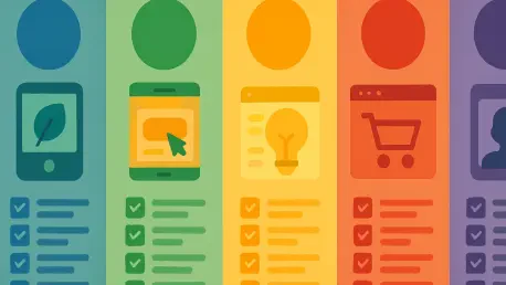
Color is absolutely fundamental in UX design because it’s not just about making something look pretty—it’s about guiding users through an experience. It helps create a visual hierarchy, drawing attention to key actions like buttons or notifications, and it sets the tone for how users feel while interacting with a product. A well-chosen color scheme can make an app or website intuitive and engaging, while a poor one can confuse or frustrate users. I’ve seen firsthand how the right colors can reduce cognitive load by making interfaces feel seamless and natural.
In what ways does color influence user emotions and behaviors beyond just aesthetics?
Color taps into our subconscious in powerful ways. It can evoke emotions like trust, excitement, or calm without users even realizing it. For instance, warm tones like orange or yellow can create a sense of energy and friendliness, encouraging users to explore or take action. Cooler tones like blue often instill a feeling of reliability, which is why you see them in banking apps. Behaviorally, color can prompt specific actions—think of red for urgent alerts or green for confirmation messages. It’s a silent language that shapes how users connect with a digital product on an emotional level.
How can color be used to help a brand stand out in the crowded digital landscape?
In a space where users are bombarded with countless apps and websites, color becomes a visual signature. It’s a quick way to communicate a brand’s personality and values. A bold, vibrant palette can make a brand feel modern and approachable, while a more subdued one might convey sophistication. When used consistently, color creates a memorable impression—users start associating those hues with the brand, even before they see a logo. It’s about carving out a unique identity that cuts through the noise and builds recognition over time.
Why is consistency in color usage across platforms so vital for brand trust and familiarity?
Consistency in color builds a sense of reliability. When users see the same palette across a website, app, and social media, it creates a cohesive experience that feels familiar, no matter where they encounter the brand. This repetition fosters trust because it signals stability and professionalism. Without it, users might feel disoriented or question the authenticity of the brand. I’ve worked on projects where aligning colors across touchpoints significantly improved user retention because people felt more connected to the brand’s identity.
Can you share how specific colors like blue or red might trigger certain feelings or actions in users?
Absolutely. Blue, for example, often evokes calmness and trust due to its association with the sky or water. That’s why it’s a go-to for industries like finance or tech, where reliability is key. Red, on the other hand, is intense—it can signal urgency or excitement, which makes it great for alerts or calls to action like “Buy Now” buttons. But it’s a double-edged sword; too much red can feel aggressive or stressful. Understanding these associations allows designers to strategically influence how users feel and act while navigating a digital space.
How do cultural differences impact the way users perceive colors in digital design?
Culture plays a huge role in color perception, and it’s something designers must consider. For instance, white often symbolizes purity or simplicity in Western cultures, but in some Eastern cultures, it’s associated with mourning. Similarly, red can mean luck and prosperity in China, while it might signal danger or stopping in other regions. When designing for a global audience, I always recommend researching these nuances to avoid unintended messages. It’s about creating an experience that resonates with users based on their cultural context, not just a one-size-fits-all approach.
What is the HSB color model, and why do you find it valuable in designing for digital products?
The HSB model stands for Hue, Saturation, and Brightness, and it’s incredibly useful because it aligns with how we naturally perceive color. Hue is the base color—like red or blue—saturation determines its intensity, and brightness controls how light or dark it appears. Unlike other models, HSB lets designers tweak colors intuitively to match a brand’s vibe or ensure accessibility. For example, adjusting brightness can improve text readability, while playing with saturation can highlight important elements. It’s a practical tool for creating balanced and effective palettes in digital design.
How can color choices enhance usability and accessibility in digital interfaces?
Color is a game-changer for usability and accessibility when used thoughtfully. High contrast between text and background, for instance, ensures readability for users with low vision. Color can also guide users by differentiating interactive elements—like making buttons stand out with a bold hue. For accessibility, it’s critical to pair color with other cues, like icons or text, so colorblind users aren’t left out. I’ve worked on interfaces where adhering to accessibility guidelines, like WCAG contrast ratios, made the product usable for a much wider audience, which is both ethical and smart business.
What advice do you have for our readers who are looking to harness the power of color in their own digital projects?
My advice is to start with a deep understanding of your brand and audience. Think about the emotions and actions you want to inspire, and research how colors might align with those goals. Don’t just pick colors because they look nice—test them in context with mockups or prototypes to see how they perform. Always prioritize accessibility by checking contrast and considering diverse user needs. And finally, keep it consistent across all touchpoints. Color is a powerful tool, but it works best when you wield it with intention and empathy for the user.